Tag Archives: Marvel

Battle for Beyond: Hulk Vs Thing

The hidden battle from Secret Wars. What we didn’t see was Hulk and Thing going toe to toe on a mountain top as the Beyonder looks on in the background through his rip in space. The latest in my digitally colored works began as an inking by Bob McLeod. The basic coloring is done using a version of the texture on a color, and one on a multiply layer. Additional highlighting done. In order to get some depth to the colour I used added some noise on an overlay layer. The logos were altered from the Marvel Versions by use of additional colour and texture. The background is cut from an image called Celestia III by Gene Martin (signature done in vectors from original). I liked how this turned out so much.. I signed it myself too rather than just putting my logo on it.

X3: Weapon X-Periment – Collosus

Using the same process as my previous piece to create collosus, and a wider shot of the same background. Here we see Collosus being forced to extend his stay in Steel form by being immersed in a vat of acid. The tank is created using layered gradient fills. The unknown model is one I have used previously (in my first Cap America manip and in a Human Torch manip)

X3: Kitty’s Dream…


…is that beneath his Man of Steel exterior Colossus has a heart of gold… :p This was just an attempt at getting a realistic effect for the organic steel. Done using both Eyecandy Chrome filter, and the built in PSP Chrome filter on overlay layers. and a bit of smudging and softening. Added the belt and additional manual highlighting. I found this picture of Cameron Mathison (which had a caption similar to the first line of these notes and set me off on the idea) and thought it would be a good pose. The background is one of the X2 concept art pieces from the official site.

Notes: I realise looking back he appears to have a 10 pack. Some guys are just greedy. Must pay more attention in future!

X2: Logan’s Art 101 Field Trip

By the time this pic goes up I hope that everyone who wanted to see X2 has managed it. This is just a quick manip based on one of the funny moments in the film. At Bobby Drake’s parents Wolverine is introduced as Professor Logan. When asked what he is professor of, Logan replies Art. I remembered this pic from the first movie of wolverine in the snow and I thought with his skill and claws, Ice Sculpture should be a piece of cake for him. Just a bit of fun, bit of blending and shading to make the statue match the pic.

Bob Mcleod – Along Came A Spider (Coloured)


This has been digitally coloured and textured from a Bob McLeod inking I downloaded from the net. All the original pic had was spidey. I tried something different as far as the lighting goes here, it is all done using PSP Illumination effect on various layers. The texture on spidey is from a chainmail I found on the net thru Google. The wall from a simple brick texture I already had, filled a layer then free deformed for perspective. I tried to get his underarm webs to be a bit shiny with chrome effect on some of the strands. It kinda looks like a still from a cartoon now.

X3: Scarlet Witch

Still got X2 fever.. here is an idea for Scarlet Witch. I decided to go with the ‘Ultimate’ surname of Lenshirr, as I guess that is what the movie makers might do. The base pic was a small pic of Shannon Elizabeth in a cream lace up top which tied at the bottom. Using this as the start point, everything else is created from scratch (I used a hood from a jacket as the basis for the cloak hood.) I particularly like how the new lacing turned out. Just a bit of fun – hope you like it…

Crimson Dynamo (Coloured)


This image was grabbed from an issue of Advanced Iron – a great fanzine which has featured the works of our (DCG) very own Welshcat. It was inked by Troy Brian. The coloring this time was done using a brushed metal texture and a red metallic gradient fill. over this i did some dodging. The background is made froma blue metallic gradient fill and a circuit board texture. The floor has hopefully come out as reflective. The metal of the suit still seems a bit flat.. I guess I need to work on that a bit more.. wish I could get me metals looking like welshcat does.

X3: Jennifer Ellison as Emma Frost #3

Final one of this concept. Thought she might get a bit chilly wandering about in the previous outfit all the time, so manipped this coat together.

It started out as a dark brown mac on a models dummy. colorised it slightly blue, duplicated the layer about 8 times set to screen which brightened it up nicely. merged these layers, corrected some color problems, them manipped the coat to fit the pose. Added some more of the x-logos to look embossed into the leather.


X3: Logan – Mutant Vs Metal

Just a quick manip of something I would like to be shown in X3.. how Wolverine’s claws were not infact artificial, but were natural. They could do this either using Magneto to extract the adamantium OR maybe just have a flashback, with a repressed memory surfacing. Started with the Wolvie X2 wallpaper. The claws were created using the metal ones as a guide. I used an actual bone texture I found online. Shaded manually. Added extra reflections to the eye. The logo is from scratch. The font is called RedFive.

Fallen Angel

Just a quick piece I threw together one slow saturday morning. This started out as a cover preview I saw over on CBR ( for Lucifer #40). The minute I saw it I thought.. hmmm thats Angel that is. First thing I did was color the hair. Then using masked overlay layers I added the Apocalypse Bust (Bowen), and a couple of trading card pictures from the net. These were all smudged to match the painted style of the original base pic. Lightning added using dodge and overlay layers. To add more interest, there are a couple of overlayed textures hopefully making it look like a mural painted on tiles. The border mask is from PSP frames.


X3: Jennifer Ellison as Emma Frost #2

Ok.. same actress as my previous Emma Frost pic, but this time I decided to try my hand at a movie style costume, rather than civies. Seeing as the White Queen always wears white(ish) stuff, I kept the movie costume white rather than black, but tried to create the style of Jean and Storm’s costumes.

Jen was originally wearing a blue leather jump suit. I cut this onto a new layer, desaturated until I was happy with the tones. This layer was then set to Hard light. Power effect, and X-ornaments taken from previous pic. Background created from scratch using freeform deform tool on a tiled texture, with gradient fills on top. The raised sections of the costume were created in the same way i described doing seams before. I think it turned out ok, and hope the movie costume is something like this. I think the standard held on by hope costume she wears now wouldnt work in the movie.. not that i would mind seeing them try;))

X3: Jennifer Ellison as Emma Frost

Not a preferred casting or anything, but I saw this lass on the TV one saturday morning singing and I went looking for pics. Jennifer Ellison is probably best known to Brits from Brookside(soap set in Liverpool) but she has just released a single. Anyways.. she is hot… She is possibly too young to play Emma (she just turned 20 at the start of May) and would really need to learn how to tone down her broad scouse accent.

The manip is a relatively simple one. The pic i chose was quite grainy so I used what i picked up from Marrow’s tutorial to get me started. She was wearing multi coloured pants. So they were first desaturated, then a slightly colored texture was added on a new layer. The X-logo on the belt is from scratch using vectors and chrome eye candy plug-in. The power effect was done using CGTalk tutorial linked by dperciful in the Hints’n’Tips thread. Added more highlighting and power reflection to her eyes, and glows to the hair, cheeks, nose from the power effect. The main X3 logo and name-tag were done from scratch again. 4 layers – 1 for aluminum texture, 1 for gradient fade on multiply, 1 for bevels on multiply, 1 for bevels on overlay. The effect is pretty neat. I may do some more pics using this actress, cos working with her is a pleasure 🙂

Brunhilde – The Valkyrie

Well, it has been about a week’s work on and off, and over 120 layers in the making, but finally here we have Rebecca Romjin Stamos as Barbara Norris aka Brunhilde aka Valkyrie.

From various web bios:

Height: 6′ 3″ Weight: 475 lbs Eyes: Blue Hair: Blonde

Occupation: Adventurer, (former) Chooser of the Slain

Place of Creation/Birth: Asgard

Known Relatives: none

Info: The Valkyrie possesses the conventional attributes of an Asgardian woman (“goddess”). Like all Asgardians, she is extremely long-lived (although not immortal like the Olympians), superhumanly strong (the average Asgardian female can lift about 25 tons; the Valkyrie can lift 45 tons), immune to all diseases, and resistant to conventional injury, (Asgardian flesh and bone is about 3 times as dense as similar human tissue, contributing to all Asgardians’ superhuman strength and weight.

The Valkyrie’s Asgardian metabolism gives her far greater than human endurance at all physical activities) She can exert peak strength for an hour before fatigue impairs her ability level. The Valkyrie has had extensive training in unarmed combat, swordplay, and horseback riding. Her natural fighting ability is unsurpassed among Asgardian women. Valkyrie employs two weapons, the enchanted sword, Dragonfang, and unnamed iron spear.

Dragonfang is the name of the sword wielded by Brunhilde the Valkyrie. An Oriental wizard named Kahji-Da was said to have carved the sword out of the tusk of an extradimensional dragon. It eventually passed into the possession of the Ancient One, who in turn gave it to his disciple Doctor Strange. Strange awarded it to the Valkyrie after the Norse goddess had returned the Black Knight’s Ebony Blade, which she had been using, to its rightful owner. The sword is virtually indestructible.

Art: Starting with an image of RRS standing in what looked like a wheat field, first thing i did was remove out the original collar line of her swim costume. The main body of the costume was created in the same fashion as my Xmen Judgement piece (see art notes). The metals were all created with various layers of gradient fills and the burn tool.

The cape was attempted using one of the tutorials Dperciful posted to the hints’n’tips thread. Added additional texturing to the resultant material. The background is actually three seperate photo’s of the Highlands up areound Ullapool – The sky and big hill is a layer, Castle Ardvreck & the water & hill on the right another layer, and the grass closest at the bottom on a third layer. I actually went as far as texturing Dragonfang (seen behind the title) before I remembered in this piece it would be in a scabard which is bound with rectangles with a deformed leather texture as is the sword handle. The font is Skeksis.

From the desk of… LocalHero

This is a little bit of fun I had early this morning.. it’s amazing what an inability to sleep can do for creativity! I wanted to do a bit of practice with perspective, so I found the pic of the desktop on Google. Then I layered on some of my recent pics and even some works in progress I am currently working on. Using the freeform deformation tool, I tried to match the perspective of the desk and pc screen. I added the C2F logo to the cup by deforming it, then cutting the top and bottom of the square logo pic to give a curved edge. then I darkened the furthest away edge multiple times as it curved round the cup. this layer was set to softlight. I duplicated the logo layer and set it to color. the art page shadows were done using the vector tool to draw straight black lines which were blurred. the shadow of the page hanging over the edge of the desk was done using a gradient fill. the cap/wolvie pic i did recently i tried to make look like a comic by duplicating that layer a couple of times offset slightly. A little bit of cutting of my first Invisible Woman pic and a new shadow, and the pencil looks like it is on top now. The WIPs showing are all based on Tom Derenick sketches. Just a bit of fun, but surprisingly effective. I am definitely going to use this to frame other art in future.

UncommonX: WWG’s Judgement

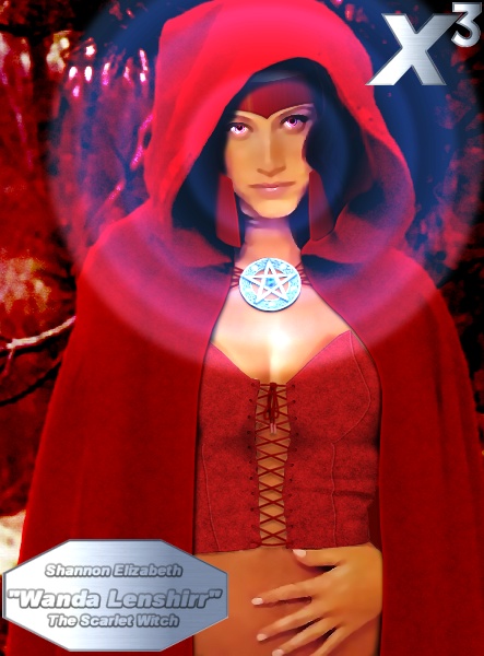
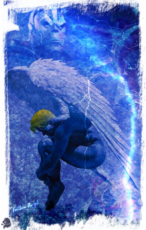
Ok, I think i’m getting an obsession for this character as I try to do it justice. Thanks to WonderWomanGoddess for letting me take a few more liberties with her baby for the purposes of a theme day. I didnt want to change the existing back story too much, but i thought she might fit into a Exiles storyline quite well.


WWG’s Original Concept: “She’s called Judgment. A near death experience gave her the power to see into a persons soul, to see their most extreme sins and virtues. She’s a vigilante, and uses her power to determine if those who cross her path live or die. Visually, she has red hair, pale skin, green eyes. Her eyes have a supernatural green glow. Her standard outfit is a black or dark green tank top, black mini or pants, and old school black cowboy boots. The only distinguishing feature about her outfit really is her belt buckle, which is a metal pentagram with a green eye in the center of it.”

My X-Men Concept: “Born in Texas just after the first Sentinel attacks, she’s called Judgement. Barely surviving a subsequent attack in which her parents were killed, the near death experience kicked her mutant power into gear. Her ability is to see into a persons soul, to see their most extreme sins and virtues. Once she has made eye contact with a person she can mentally cause them to experience any of the pleasure or pain that they have inflicted on another individual. Visually, she has dyed multihued hair, pale skin, green eyes. Her eyes have a supernatural internal green glow.

Her X-Uniform consists of blue bodysuit with black X and green pentagram on her chest and matching cowboy hat. She wears special emerald quartz sunglasses designed by Professor X which enable her to focus her power more easily as well as supplying additional information from a computer built into her suit. The only other distinguishing feature about her outfit really is her belt buckle, which shows metal pentagram with a green snake eye in the center of it.

Judgement has studied various mystical arts and uses the belt as a channel for these powers. Judgement keeps roots, herbs and potions handy in her strap on leg pouch. Grabbed from her own timeline by the Timebroker, Judgement must help the other Exiles put right the fractures in time and someday return home.”

How I got here: The base for this pic was a nude of model Kim Foreman standing in a room wearing a white couwboy hat and a belt. The first thing i did was smooth out the skin, removing any blemishs. Next I removed her nipples(ouch!) and smudged and blended the area between her breasts where her suit would be stretched. I smudged and smoothed the original belt logo and added my own pentagram using softened lines on layers set to overlay or multiply. The eye is an actual snake eye made to look glassy. Green glow added to buckle and hands.

Now it was time to start the suit. I had a couple of attempts before I decided on what you see here. I used the fauxsuede texture (that I used in my Angel – Back in the High Life manip) to fill a new layer. I colorized this layer blue, then cut away the extra to leave only the areas that would be the suit or the hat. With the initial cutting complete, I duplicated this layer twice. the original layer’s mode was set to color. the second layer’s mode was set to burn at 25% opacity. the third layer’s was set to multiply at 75% opacity (obviously i had a bit of experimenting) but these produced the best results.

Next thing was to start drawing the zips, seams patterns on the costume. In order to get some neatness to the whole thing, I first used the vector shapes tool to draw a five pointed star, which i deformed to the look as though it was sitting on the stretched uniform at her chest. I then did a very large X in Arial Black ( @ 244pnt) which i deformed to match the placement of the star. I then used the freehand vector tool to draw the initial lines in white(set to overlay) and black. the black layers were duplicated set to multiply and gaussian blurred at about 3. I think this gave a nice stitched effect.

A similar routine for the wrinkles. The central zip line was done in the same fashion but with an additional blurred black layer to give more depth. In order to get a bit of realism, I added the little horizontal stitching at the bottom of the zip, and the actual zipper at the top was cut from another photo and pasted in. A bit of judicious cutting and coloring and it blended in nicely. Next was the collar and cuffs with the additional stiching in the same fashion as on the chest. It looked a bit bland with just the stitching so i used the lassoo tool to select the large chest X and then used that selection to desaturate the textured multiply layer, giving a two tone uniform. I decided to color the pentagram on the chest too, and I think i managed to achieve a raised plasticy feel to it.

Some small X insignias were added to the collar by the zipper to increase the uniform rather than costume feel. The leg pouch was created from scratch following the same pattern as the rest of the uniform. Drew some lime green semi circles free hand over her irises set to dodge at 50% opacity. This gave some nice green lowing eyes. The green glasses were made from scratch, in a similar way to my earlier Transgender piece, and i think i got the shadow and glass looking a lot nicer this time.

The hair was the models own(blond). Because of the new layers fro the costume I had to add some new strands to make up for the sloppy cutting out i did. This was then given a gradient color. The background is a woodland one I had on my hard disk for ages. I put it on a lyer over the top and then cut out the model shape using the texture layer as a guide. This seemed simpler than cutting away the original background. Well.. i think thats about it.. Once again, thanks to WWG (hope i didn’t stray too far from your concept). Hope you all like it and enjoy the film too.

Joe Fixit – Grey Hulk

Well, someone used my old Hulk manip as a basis of a Joe Fixit pic. I thought i could do better so here it is. Starting with the original pic(which combined a Randy Bowen bust with a Jim Sweet statue and Lee Priest’s legs), minus the desert background, I removed the green hulk head. I remembered seeing another randy bowen statue of Fixit, and managed to find a publicity pic of the head and shoulders. I cut n pasted the head and neck onto a new layer over my hulk and began blending it in. I colorized the skin on all the layers with the same blue/grey. once everything was looking ok, i deformed the background hulk so it was a bit shorter and thicker. this would form the basic shape for joe fixit. I found a nice pic of a suit to use as a base, cutting various sections apart and blending them together on a new layer of the hulk pic. I’m not too happy with how the arms turned out, but was the best i could do in the circumstances. The legs of the suit from the original pic didnt cover the whole of hulks legs, so i duplicated and deformed them. I applied a woven blue texture over the whole suit set to overlay. the part over the tie was colourized to make it purple to match the hatband. next i added some highlights and shadows. finally the background and logos were added. the background was a bit bright, so i duplicated the layer, gaussian blurred it at a setting of 3, colorized it blue, then set it to multiply at about 50% opacity. Hope you like.

Captain America & Patch: Red Skull Dairies


Another digitally coloured Tom Derenick sketch. I particularly like how this one turned out. Some of it was very fiddly, but using the lasso tool to help me restrict where i was coloring helped. I am actually enjoying this colorist lark.. whether i have found my new calling in life is another matter. The Cap logo is done from scratch, and you may recognise the Wolverine logo from my earlier Hulk Vs Wolvie pics.

Nostalgia Is An Incredible Thing

A closer look at an element from yesterday’s image. Another digitally colored and textured Tom Derenick piece. This began as a page layout for the Avengers Vs Fantastic 4 i think, but I thought it would work well as a standalone snapshot style image. I like the dynamic feel of Tom’s work, and Jarvis rushing the staff out of the room in the background is a great touch. I thought it would be funny if this was Ben sending Bruce a little hint that he was up for a rematch, hence the handwritten message.

From the Desk of… Benjamin J Grimm

Well I guess this could either be the sequel or prequel to my ‘Ben baiting Bruce’ pic. I think it works better as the sequel, given the newspaper article.

The Bugle front page was created from scratch using a black n white sketch of the hulk i downloaded ages ago which had a news photo quality to it. (I have realised this was by Jim Sweet). The banner (no pun intended) line logo was cobbled together from a couple of pics. The article text made up on the spot. The desk also shows a couple of my Derenick/Hulk related pics. The small corner visible on the right is an Alex Ross recreation of the first Fantastic Four cover. An excercise in perspectives, but fun none the less.

National Register: Bigfoot says…

..Bigfoot Smash!

..Leave Bigfoot Alone!
Another quickie i did to pass an hour or so.. This pic started out as a black and white Tom Derenick sketch I found on the web. The pose of the Hulk looked reminded me of that famous Bigfoot picture. Nothing special in the process – some coloring, cut n paste onto a suitable background. logo from Hulk cover pic. Decided to run it thru a TV scanline filter for extra interest. I think Jack McGee would have killed for a picture this good.. 🙂