Tag Archives: Marvel

Shadowcat’s Pryde

Another Tom Derenick sketch quicky coloured and textured by me. the coloring was done via colour and multiply layers. The wall texture is one i had on the PC for a while, skewed to fit the perspective. The ‘window’ is a crome effect using eyecandy again skewed to fit. drew the window frame using vector tool. Turned out pretty sweet for about 45 mins work.


Ultimate Spiderman Coloured

This started out life as a Francis Manapul sketch I downloaded off the net. Digitally colored, although im not sure the highlighting is working. Tried to make it look like the cover of the comic. The logo was originally taken froma jpeg of the comic cover, but only the ultimate part was relatively clean. I used the vector tool to draw a new spider, and added new spider-man text. new drop shadows added. the spider looked a bit flat, so i used the vector to create a selection, which was used in eye candy to create a chromed layer for overlaying. Turned out not too bad for just over an hours work.

1st Pic Redo: Invisible Woman

Well, it’s been about year since I found this site and began enjoying the artwork everyone posts to the DCG. While I know it’s not a year since i started posting art myself, I was at a loose end today so I thought I would have a go at the first pic i submitted.


This time we see Sue Richards and everyones favourite ever-lovin’ blue eyed Thing in a corridor on a Skrull ship. Starting with the same grainy 50s/60s cheescake drawing, first thing I did was smooth out the face, and the edges of her existing underwear. Her eyes were a bit smudge so I made some new ones. The costume was created using a faux-suede texture on various multiply colour and burn layers. The seams added using white lines on an overlay layer and a black line, together with a black line gaussian blurred on a multiply level for depth. The 4 logo was done from scratch using vectors. To create the gloves, collar and belt (or bottom hem.. was never quite sure) I desaturated areas of the texture multiply layer.

The background was found via Google, resized and cut to fit the dimensions i was going for. The Thing was from the gift i did for Squedge (using Squedge’s own Thing sketch). I created a deeper rocky feel by adding additional rocky texture on a multiply layer. The shadow on the floor was created by flipping Thing, selecting the area, filling the shape with a gradient and applying a blur. this layer was set to overlay. I think the combination works with the angle of the background image. Suzies invisibility was done by using a graduated irregular mask to fade out the layer she is on. The font for the logo was downloaded from http://www.ffplaza.com/ check it out if you are at all interested in Fantastic Four.

Falcon

Ok, here is another piece that I have had hanging about in my works in progress folder for what seems like forever – The Falcon

I decided to take another stab at it from scratch. The model is bodybuilder Shawn Ray. First thing i did was cut him out from the background. Duplicating that layer, I used the smudge tool to soften the muscle tone where the uniform would be. I duplicated tis softened layer. I colorized this layer a deep maroon. The other softened layer I adjusted the lighting and saturation until i got a near white. These would form the basis of the uniform by strategic use of the lasso tool to cut away the white.

In order to get the seams I used the vector tool to draw in black initially each seam. this layer was set to overlay. I duplicated this layer and changed the lines to white, offset slightly from the original and set it to softlight. I think this gives a nice feeling for the seams and joins. The darker layer was duplicated and gaussian blurred to give some depth. The wings were taken from an actual falcon. The uniform still looked a bit flat, so i found a nice leather texture which i overlayed ontop of the colored layers. It hasnt survived the reduction to fit the size limit (C2F) that well.

The background was created by using a picture of a falcon in flight to provide a base for outlining with the vector tool. this outline was used to contain two seperate gradient fills, red inside, blue outside. this filled layer was set to multipley over a plugin generated cloud layer. Another cloud layer was put over the top of the whole pic set to soft light. I think all in all it turned out ok.

Concept: Human Torch

This is just an experiment in recreating the latest take on the Human Torch (seen in the upper right background). I thought the Heath Ledger pose conveyed the cocky feel the character has.

The original tshirt logo was removed by cloning and smudging the original green tshirt. This unfortunately meant the texture was lost. I got around this by creating a soft light layer with a blue woven cotton texture on it. This layer was duplicated and set to color. The 4 logo was done using the vector tool on an overlay layer. The flames and skin were done suing various reds and oranges on overlay layers to give a glowing ember feel. I dunno if the fire effects really work, but for a quick concept it conveys the idea.

Ultimate Hulk Vs Captain America

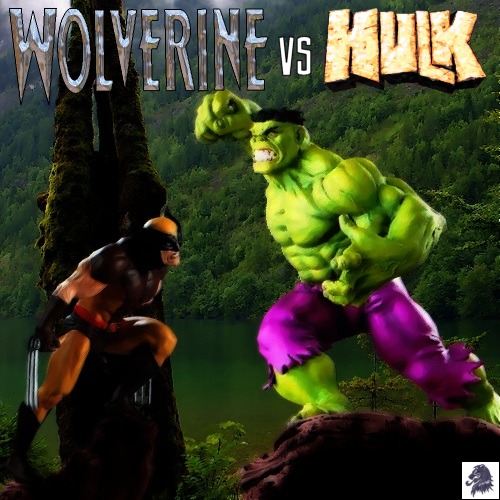
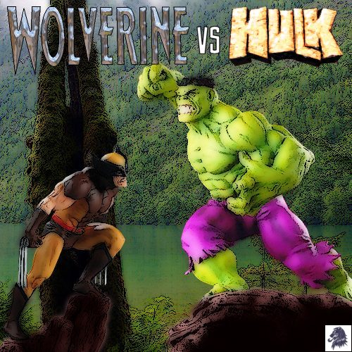
Well.. what we have here is my attempt at recreating part of the Hulk Vs Cap battle from Ultimates #5. At this point they have had a tussle, with Cap coming off the worst at first. He steps back to check on the other team members before plunging back into the fray…

The image is made from a poseable Hulk statue and a Ult Cap America bust (both Bowen i think..). The hulk statue was posed against its box so the first thing i had to do was remove the box by cloning other parts of the grey dappled background. Using the smudge tool i then removed the joint lines on hulks legs arms ankles and neck. The Cap bust was simpler, as it was to be in the foreground, i just removed all trace of the original background.

I found an earthquake damaged street scene on Google and cut it up into chunks for the mid ground between hulk and cap and the background behind them. These parts were all tinged with a blue wash and darkened to keep the tone matching. Fire and glow added to the windows.

I desaturated the Cap layer by about 25% (more on that later). I roughed up Cap a bit by giving him a black eye and bloodying his nose, with a splash of blood onto the star on his chest too. This was done on an overlay layer with muted reds and blues that were then smudged to blend in a bit. Added dirt and dust to cap’s uniform by creating a smoke effect on a ‘color’ layer using Eye candy plugin. This was then coloured blue again to match the street dust. The shield was copied to a new layer and PSP built in chrome filter applied. This layers blend mode was set to multiply at 50% opacity. I then duplicated the main Cap layer and applied some spot lighting using the PSP illumination tool. This layer’s mode was set to soft light at 75% opacity. This brought the saturation levels back almost to where they were, but with a new lighting bias. (see it told you i would get there…)

The sky was from the net, recoloured and flipped. The Apache helicopters were also from Google, deformed to fit the pic. Added lights manually. The search lights were a gradient filled triangle, softened and set on a screen layer. The flames in the building windows were made by using the pen to draw in red, then two oranges, then a yellow, with the same colours used around the window frames. This layer was then duplicated set to screen and gaussian blurred with a radius of about 3 to get the glow. The three tracer bullets were done in a similar fashion, with the path being gradient filled vector lines.

Altogether this pic is made of about 30 layers.

Angel – Back in the High Life Again

This is the follow up to my Angel Introspective manip using model Marcus Schenkenberg as Warren Worthington III (while still in his post Apocalypse blue phase).

Starting with the previous manip (minus the ornaments), the first thing i needed to do was recolour the skin to a more natural tone. After a few failed attempts, i found that by selecting the blue skin area, promoting it to a new layer, making it negative, and setting the blend mode to colour, i got a nice tanned look. I cut away the areas of the new ‘skin’ where i still wanted the tshirt to be blue but i found it was too washed out. so i again selected the blue skin promoted it to a new layer and set the blend mode to multiply to get a richer blue. A similar process was done to create the white central strip.

The halo was done using the vector tool and highlighted and shaded manually. The collar and sleeve edging was also done using the vector tool. wrinkles on the tight tshirt body and sleeves drawn as small Vs, then smudged to give a nice feel. The tshirt still looked a bit flat, so i had a look through some of my textures and found a nice one called fauxsuede that i applied over the top on a soft light layer. The background buildings are simply lots and lots of gradient filled boxes layered on top of each other. The car i used is the Pagani Zonda, again on a soft light layer. Between the wings I added a magazine scan i downloaded from the net of Angel in costume but still with his long blond hair to match my image.

Angel Introspective – Warren Worthington III


Time for a quick manip. Here is model Marcus Schenkenberg as Warren Worthington III (while still in his post Apocalypse blue phase – but with regrown natural wings). It was created from two pics of Marcus, a small grainy one i found of him sitting in a very orange room with wings.. and a second larger black and white image. Enlarging the winged image, I cut out the wings and put them on a layer behind the black n white pic. Much smudging and cursing later and i got it looking reasonable. I smudged the black n white pic and colorized the skin and jewellry. The hair was done on a seperate layer and turned out not bad although it is still a bit smudgy at the ends. The pic at the background is Stirling Castle. The logo font is Federation.

HULK – The Movie Adaptation

Just a cover concept for the adaptation of the HULK movie into a graphic novel. I think it kinda has an Alex Ross feel to it.

This is the latest in my series of manips based on busts.. although the base pic for this wasnt a bust as such.. but a cookie jar!!!. I found the base pic while browsing through a comic memorabilia store online, and it immediately caught my attention because of the quality of the sculpting. The first thing i had to do was remove the line where the lid (head and shoulders) and the body met using the smudge tool. I continued to smudge over the pic to get a more painted look. The bottom of the jar was smudged out to give the impression of paint thinning at the edges. Next I duplicated the layer, applied a gaussian blur of about 4, applied my own combination of brush stroke filters, and set the layer mode to lighten, this gave the picture a pleasing glow.

The Hulk logo was added and givem the same treatment. The ‘cloud’ box around Hulk is just that. It was a bluish picture of clouds at night, which again was given the paint treatment. This was placed on a new layer over Hulk, with the mode set to exclusion, which gives the greeny faded look. The area directly over the hulk was cut away and the edges softened to accentuate the glow. Finally grabbed the marvel logo from their site. I think it turned out pretty nice, so i hope the rest of you like it too.

Phoenix

Just some random model off the net as X-men mainstay Jean Grey.. AKA Phoenix. To get a glossy effect on the costume, each part was cut out using the lasso tool, promoted to a new layer, the built in PSP chrome filter was then applied and the whole thing softened using a gaussian blur. I then colourized each layer and set them to multiply the over the original skin color. The phoenix logos were added, with the smaller one being rotated and skewed using the freeform deform tool. The sash is made of some gauzy material coloured gold and here serves an additional purpose of sparing her blushes due to the tightness of the uniform;) (And Yes her neck was that long!)

Namor: The Sub-Mariner

A mock up of a cover for a Sub-Mariner comic book. I’m not sure who the model is but i found it thru a link Lady D posted [Thanks :)]. I Added additional water at the front and extended the background above to allow make a nicer size canvas (although looking at it again it needs more work still to make it a bit less obvious – hindsight eh!). Added the belt, buckle and bracelets using various gradient fills and the burn tool. The buckle is based on an actual shell. Gave him ear points using the smudge tool. Shorts coloured. Logos and title added.

Wolverine Vs Hulk #1

Another in my series of manips using busts as the basis for the picture. This is the first version of a pic using Hulk and Wolvie busts to recreate their battle in the woods, this time beside a lake. The hulk model is pretty much untouched other than altering the angle a bit to give more of a lunge. Wolvie I had to alter the angle of the head so he was looking upward slightly rather than down. The combined pic was then run through my ‘grainy drawing’ process to give the effect you see and I added the logos.

Venom

Previously: Well this is one that i have had hanging about incomplete for a looooong time. It started as a black and white photo of body builder Frank Hillebrand. A lot or burning and multiplying and addition of a head made him venom. At this stage I drew a blank as to what background to put it on. Today: I finally got the inspiration (based on my Black Widow pic) to having him towering over a cityscape of New York, so here it is 🙂

Target: Warren Worthington

Just a quickie really. After i submitted the Beast pic, I figured I could do the same to classic Angel. Again it was a bust on a rock, found a matching background (The eagle eyed among you may recognise it from an early hulk manip i did). A bit of cutting n blending and a few filters and i had a painty pic. i added the heads up display as though a Sentinel was targeting him – hence the title. The red ‘beam’ through the pic is Cyclops clearing a path through the Sentinel for Angel.

Target: Scott Summers

Just a quickie really. After i submitted the Beast pic, I figured I could do the same to classic Cyclops. Again it was a bust on a rock, found a matching background (The eagle eyed among you may recognise it from an early hulk manip i did). A bit of cutting n blending and a few filters and i had a painty pic. i added the heads up display as though a Sentinel was targeting him – hence the title.