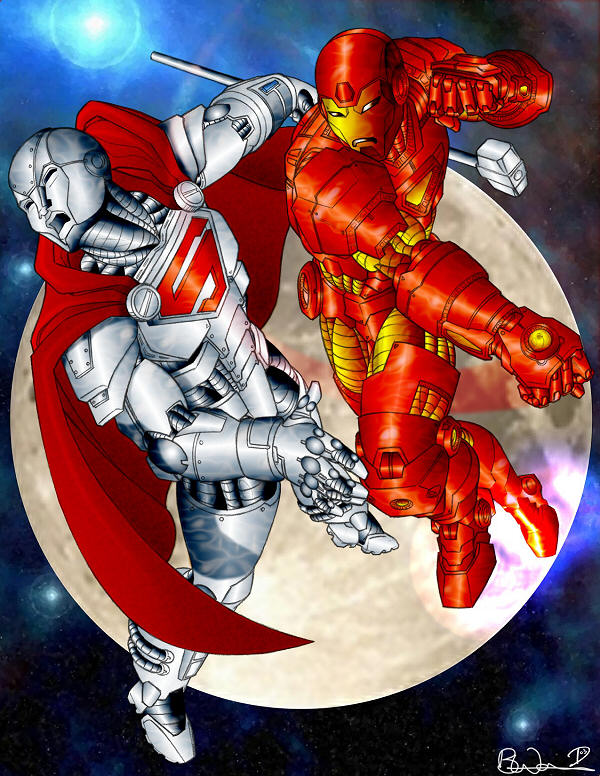
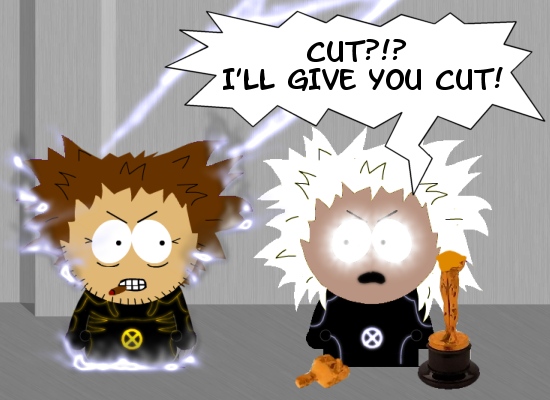
My attempt at colouring Dean’s great drawing. I won the coloring/painting contest over at C2F with this entry. Looking back at it myself, I think they both would have benefited from a bit more shading at the joints etc. Ah well. Hindsight vision is always 20/20!
Category Archives: Coloring
Spider Sense Tingling…
I found this sketch on Google and figured I would have a go at colouring it. I don’t know the artist other than it has initials PM on the wall. I decided to go for a lighter feel to the pic this time. Done by colorizing the different sections using my wacom pen, then smudging it all for a soft painted look. The logo was done using vectors.
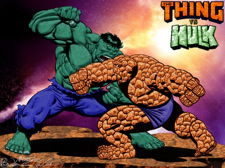
Battle for Beyond: Hulk Vs Thing
The hidden battle from Secret Wars. What we didn’t see was Hulk and Thing going toe to toe on a mountain top as the Beyonder looks on in the background through his rip in space. The latest in my digitally colored works began as an inking by Bob McLeod. The basic coloring is done using a version of the texture on a color, and one on a multiply layer. Additional highlighting done. In order to get some depth to the colour I used added some noise on an overlay layer. The logos were altered from the Marvel Versions by use of additional colour and texture. The background is cut from an image called Celestia III by Gene Martin (signature done in vectors from original). I liked how this turned out so much.. I signed it myself too rather than just putting my logo on it.
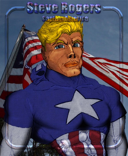
Steve Rogers Captain America (Kodiak) Coloured
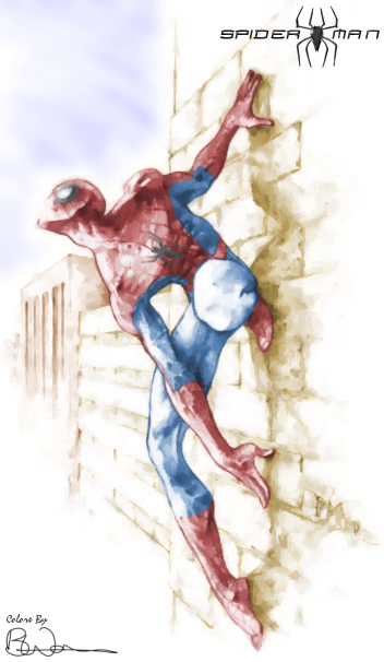
Bob Mcleod – Along Came A Spider (Coloured)
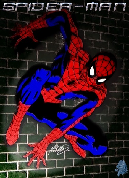
This has been digitally coloured and textured from a Bob McLeod inking I downloaded from the net. All the original pic had was spidey. I tried something different as far as the lighting goes here, it is all done using PSP Illumination effect on various layers. The texture on spidey is from a chainmail I found on the net thru Google. The wall from a simple brick texture I already had, filled a layer then free deformed for perspective. I tried to get his underarm webs to be a bit shiny with chrome effect on some of the strands. It kinda looks like a still from a cartoon now.
Ultimate Spiderman Coloured V2
I listened to the comments and had a further stab at this one. I think the new version has more volume to it. The eagle eyed may notice a few extra tweaks to the textures n reflections.
Crimson Dynamo (Coloured)
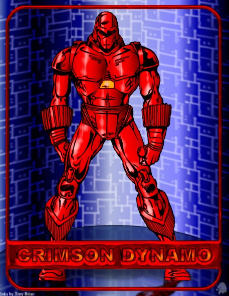
This image was grabbed from an issue of Advanced Iron – a great fanzine which has featured the works of our (DCG) very own Welshcat. It was inked by Troy Brian. The coloring this time was done using a brushed metal texture and a red metallic gradient fill. over this i did some dodging. The background is made froma blue metallic gradient fill and a circuit board texture. The floor has hopefully come out as reflective. The metal of the suit still seems a bit flat.. I guess I need to work on that a bit more.. wish I could get me metals looking like welshcat does.
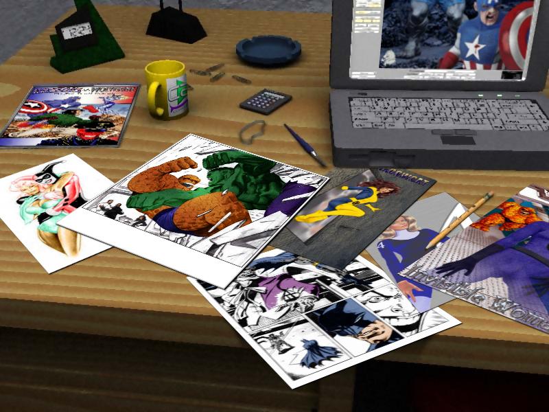
From the desk of… LocalHero
This is a little bit of fun I had early this morning.. it’s amazing what an inability to sleep can do for creativity! I wanted to do a bit of practice with perspective, so I found the pic of the desktop on Google. Then I layered on some of my recent pics and even some works in progress I am currently working on. Using the freeform deformation tool, I tried to match the perspective of the desk and pc screen. I added the C2F logo to the cup by deforming it, then cutting the top and bottom of the square logo pic to give a curved edge. then I darkened the furthest away edge multiple times as it curved round the cup. this layer was set to softlight. I duplicated the logo layer and set it to color. the art page shadows were done using the vector tool to draw straight black lines which were blurred. the shadow of the page hanging over the edge of the desk was done using a gradient fill. the cap/wolvie pic i did recently i tried to make look like a comic by duplicating that layer a couple of times offset slightly. A little bit of cutting of my first Invisible Woman pic and a new shadow, and the pencil looks like it is on top now. The WIPs showing are all based on Tom Derenick sketches. Just a bit of fun, but surprisingly effective. I am definitely going to use this to frame other art in future.
Superman – Last Son of Krypton Colored
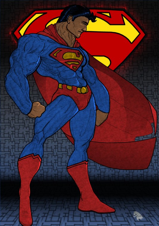
This sketch was downloaded from kodiakcomics.com. I wanted to do something a little different in the coloring because of the chest detail. I made a copy of the sketch on a new layer. on a layer over that i applied a blue suede texture on multiply. These two layers were merged to provide the base for coloring the pic. i filled another new layer with the blue suede texture. using the lasso tool, i followed the outline of superman to cut away the excess from both layers. I then used the lasso and colorize tool to recolor each layer for the cape belt etc. The suede layer was set to overlay to enhance the color and texture. I then ‘inked’ over the main borders and edges. Then i created a new dodge layer for use in the highlights. these are softened gradient filled selections. The cape was darkened under neath using a gradient fill on a multiply layer. The background is made up of several more layers – my vector S logo, a black-white gradient, a white-blue gradient, and the ‘circuit’ texture. I deformed the bottom section of the circuit to create the floor for supes to stand on. I added the gradient at the join to give the impression of a curve where floor and wall join. The s-logo has a blurred corona around it on a dodge layer.
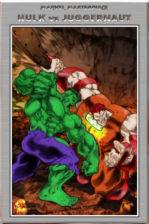
Hulk Vs Juggernaut Colored
Captain America & Patch: Red Skull Dairies
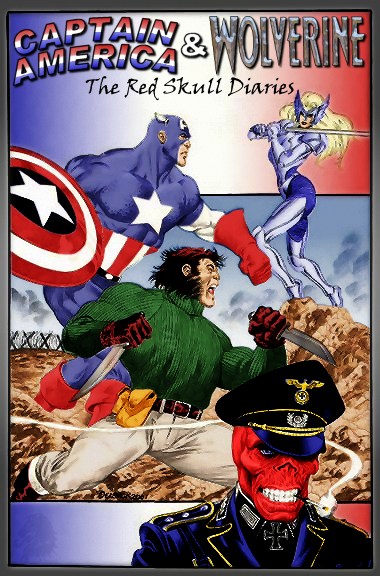
Another digitally coloured Tom Derenick sketch. I particularly like how this one turned out. Some of it was very fiddly, but using the lasso tool to help me restrict where i was coloring helped. I am actually enjoying this colorist lark.. whether i have found my new calling in life is another matter. The Cap logo is done from scratch, and you may recognise the Wolverine logo from my earlier Hulk Vs Wolvie pics.
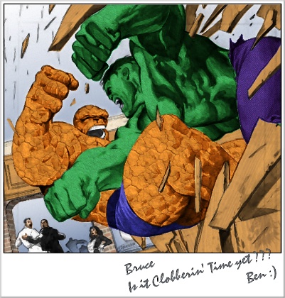
Nostalgia Is An Incredible Thing
A closer look at an element from yesterday’s image. Another digitally colored and textured Tom Derenick piece. This began as a page layout for the Avengers Vs Fantastic 4 i think, but I thought it would work well as a standalone snapshot style image. I like the dynamic feel of Tom’s work, and Jarvis rushing the staff out of the room in the background is a great touch. I thought it would be funny if this was Ben sending Bruce a little hint that he was up for a rematch, hence the handwritten message.
From the Desk of… Benjamin J Grimm
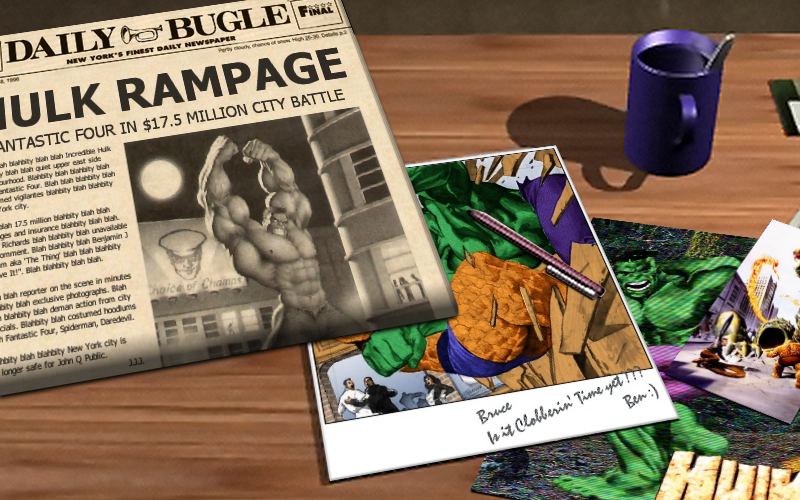
Well I guess this could either be the sequel or prequel to my ‘Ben baiting Bruce’ pic. I think it works better as the sequel, given the newspaper article.
The Bugle front page was created from scratch using a black n white sketch of the hulk i downloaded ages ago which had a news photo quality to it. (I have realised this was by Jim Sweet). The banner (no pun intended) line logo was cobbled together from a couple of pics. The article text made up on the spot. The desk also shows a couple of my Derenick/Hulk related pics. The small corner visible on the right is an Alex Ross recreation of the first Fantastic Four cover. An excercise in perspectives, but fun none the less.
National Register: Bigfoot says…
..Bigfoot Smash!
..Leave Bigfoot Alone!
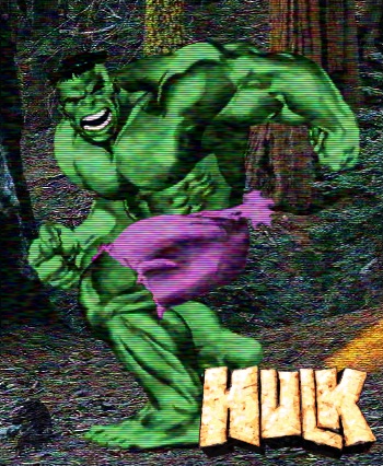
Another quickie i did to pass an hour or so.. This pic started out as a black and white Tom Derenick sketch I found on the web. The pose of the Hulk looked reminded me of that famous Bigfoot picture. Nothing special in the process – some coloring, cut n paste onto a suitable background. logo from Hulk cover pic. Decided to run it thru a TV scanline filter for extra interest. I think Jack McGee would have killed for a picture this good.. 🙂
Shadowcat’s Pryde
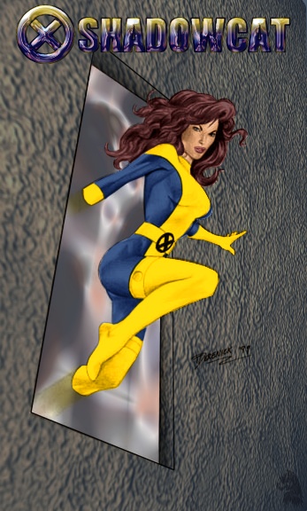
Another Tom Derenick sketch quicky coloured and textured by me. the coloring was done via colour and multiply layers. The wall texture is one i had on the PC for a while, skewed to fit the perspective. The ‘window’ is a crome effect using eyecandy again skewed to fit. drew the window frame using vector tool. Turned out pretty sweet for about 45 mins work.
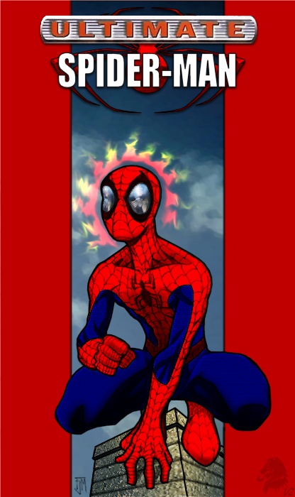
Ultimate Spiderman Coloured
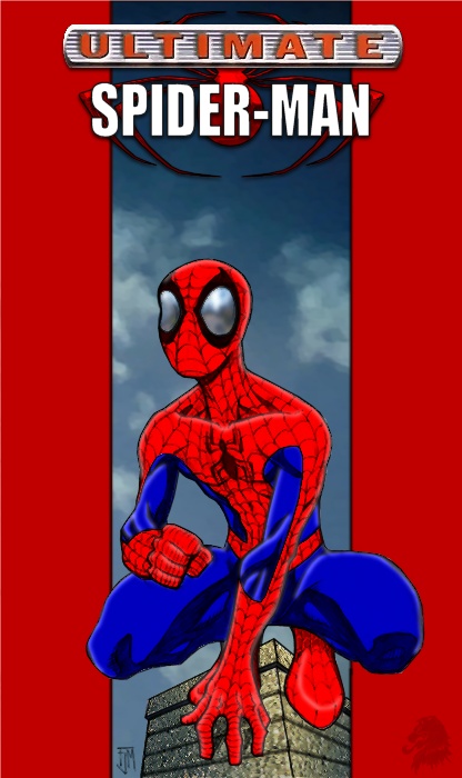
This started out life as a Francis Manapul sketch I downloaded off the net. Digitally colored, although im not sure the highlighting is working. Tried to make it look like the cover of the comic. The logo was originally taken froma jpeg of the comic cover, but only the ultimate part was relatively clean. I used the vector tool to draw a new spider, and added new spider-man text. new drop shadows added. the spider looked a bit flat, so i used the vector to create a selection, which was used in eye candy to create a chromed layer for overlaying. Turned out not too bad for just over an hours work.
1st Pic Redo: Invisible Woman
Well, it’s been about year since I found this site and began enjoying the artwork everyone posts to the DCG. While I know it’s not a year since i started posting art myself, I was at a loose end today so I thought I would have a go at the first pic i submitted.
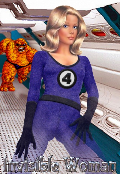
This time we see Sue Richards and everyones favourite ever-lovin’ blue eyed Thing in a corridor on a Skrull ship. Starting with the same grainy 50s/60s cheescake drawing, first thing I did was smooth out the face, and the edges of her existing underwear. Her eyes were a bit smudge so I made some new ones. The costume was created using a faux-suede texture on various multiply colour and burn layers. The seams added using white lines on an overlay layer and a black line, together with a black line gaussian blurred on a multiply level for depth. The 4 logo was done from scratch using vectors. To create the gloves, collar and belt (or bottom hem.. was never quite sure) I desaturated areas of the texture multiply layer.
The background was found via Google, resized and cut to fit the dimensions i was going for. The Thing was from the gift i did for Squedge (using Squedge’s own Thing sketch). I created a deeper rocky feel by adding additional rocky texture on a multiply layer. The shadow on the floor was created by flipping Thing, selecting the area, filling the shape with a gradient and applying a blur. this layer was set to overlay. I think the combination works with the angle of the background image. Suzies invisibility was done by using a graduated irregular mask to fade out the layer she is on. The font for the logo was downloaded from http://www.ffplaza.com/ check it out if you are at all interested in Fantastic Four.
Captain America – Our Shining Light
Old Wingnut is Back…
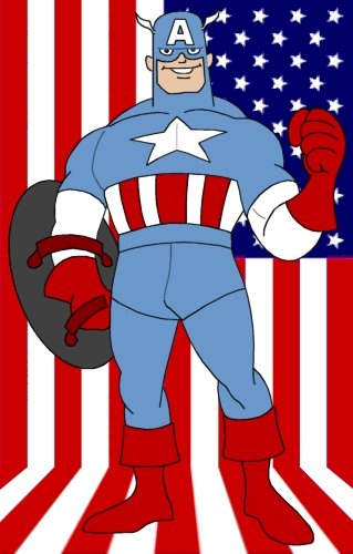
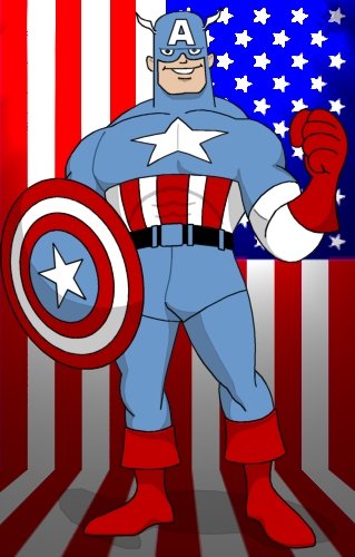
I was looking through some old files and came across a sketch for an animated style Cap. I can’t remember where the original idea came from so I’m afraid i can’t credit the original. I decided to do some simple coloring in Paintshop. I think it turned out quite nicely. I might even try my hand at a bit of shading on it.
Clark’s Worst Nightmare
Captain America Parking his Shield
America’s Stupidest Heroes: Green Lantern
The Great Divide…
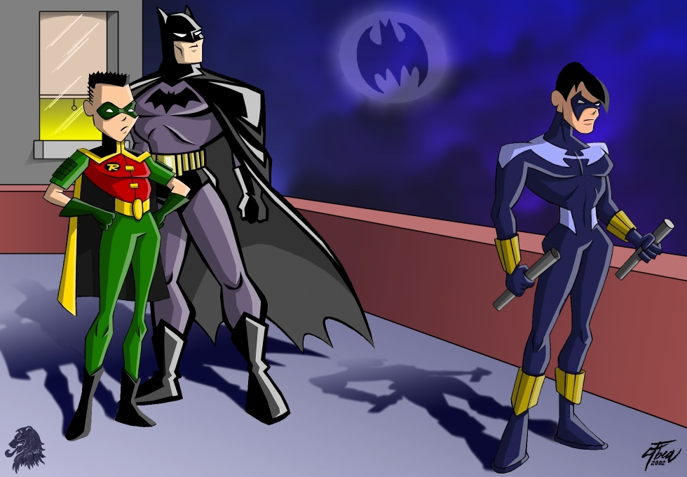
Albea’s great work in the Timm style inspired me to do a quick manip of a few of his pieces into one scene. I thought the poses of the characters would be great to illustrate the rift between Nightwing(the original Robin) and Batman (& the new Robin). Let me know what you think, this was just a quickie to see how the pics would look together and I think it turned out quite well. As usual all characters by Albea, layout and background by me.
A SPark-ling Performance?
Endless Love?
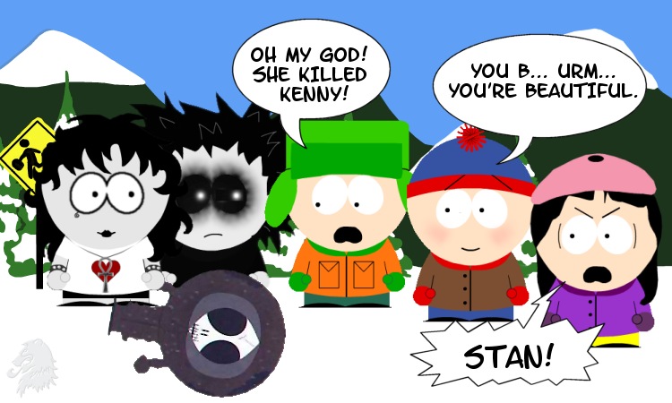
Well i thad to happen didn’t it. Death & Dream visit the small mountain village of South Park. Death meets Kenny, who she thinks is kinda cool. But the course of true love seldom runs smoothly, and when they hold hands the inevitable happens. The rest of the story is pretty obvious. We have Death (with Kenny), Dream, Kyle, Stan and of course Wendy. I used the page applet to get the basics done, then tweaked and added stuff in PSP. Brought them altogether at the bust stop (which i extended a bit). I think the dialogue works well;) Info: Ryanarya posted this link to a page where you can create your own characters in the South Park style: http://www.comedycentral.com/southparkgames/character/

